

Westpac - Rebrand / Motion

Westpac Chopper animation
I had the great opportunity to work on the Westpac re-branding and also come up with a concept of the new “chopper animation” which is a main part of the brand image. I had to incorporate the helicopter “blades” into the visuals and create a 3-5 seconds animation which will be used all across the new brand look from TVC’s to posters. I have created multiple options and ended up on the (diamond) look where the main colours come together and start to rotate as a helicopter blade and quickly revealing the “W” Westpac logo.

You can see here how the camera and the shapes moves around to create the “Chopper animation”

Text and movement
The new brand using “micro interactions” where some parts of the message has a uniq movement. Like the fastest stretches in with a dynamic movement or the break word glitches.


Illustrations


It was very exciting to work on illustrations as well. My main goal was to use simple geometric shapes to “build” up the characters and the background. Using the new brand colours were challenging and exciting in the same time. I used a textured brush to bring out the shadows and highlights to create depth for the elements/characters.
I have created a grid system where we can see how the brand works with shapes, colours and adding the assets in step by step to build it up.
How the Logo works

Logo look and feel
I was working on the Westpac logo animation focusing on the “W” shapes. I used the middle rectangle shape as a unit and multiplied it 4x times to measure the distance where the shapes can slide in. I also created a visual representation of the logo, scale and the new brand colours relationship.
Social Media placements

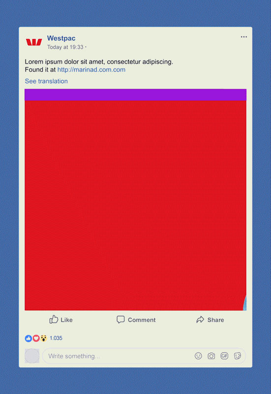
I was also working on the Westpac brand social media motion design feel. I was incorporating the brand colours and the slide bar as a feature that can “wipe” the screen to the next slide as a transition.
Posters and OOH


Client: Westpac
Agency: Interbrand
Creative Director: Alex Creamer
Motion Graphics and Illustration: Robert Pregardt-Paur